Page Layouts
When Web Controls are arranged inside of Web Pages, their placement determined by the Page Layout, which, by default, changes according to the size of the screen that is being used to access the application. This allows the application UI to remain relatively uniform regardless of screen size.
The Page Layout can be modified in the the Page Layouts section found in the Tree of the Web Flows Builder. This branch of the Tree is structured as follows:
Standard Layout - defines the layout of Web Pages that are not opened as modals.
Mobile - defines the layout of Web Pages opened on mobile devices. By default, this is defined by screens less than or equal to 800 pixels wide, although this is customizable.
Desktop - defines the layout of Web Pages opened in browser windows. By default, this is defined by screens more 800 pixels wide, although this is customizable.
Modal Layout - defines the layout of Web Pages that are opened as modals from a Desktop Layout.
Page Layouts consist of nested Containers, including a special one designated Main Content. This is the Container that holds the contents of the Web Page. Navigating to a new Web Page changes what Main Content is displayed, but will otherwise not change any aspect of the Page Layout, which is applied to the application universally.
Standard Layout
Standard Layouts apply to all Web Pages that are not opened as modals. They are defined by nested Containers, including one called Main Content.
Just like the Containers used as more conventional Web Controls, styling changes can be applied to the Containers that define Standard Layouts. Web Controls can also be added to them, which is how App Headers are created.
There are two kinds of Standard Layouts: Mobile and Desktop, only one of which can be used at a time. Making changes to one will not influence the other. Creating a header to display in the Mobile Layout, for instance, does not mean that a header will automatically display in the Desktop Layout.
Mobile
The Mobile Layout is intended to be used when Web Pages are opened on mobile devices. By default, this is defined by windows less than or equal to 800 pixels wide. To change this, Inspect the Mobile element and change the value given under Advanced Options > Use When.

This field expects a Boolean. The Mobile Layout will be applied to Page Layouts when Mobile > Advanced Options > Use When is equal to TRUE.
The default value of Use When is given as follows:
browser.width <= 800browser.width refers to a standard value automatically collected by the Airkit platform. See Standard Journey Data for more information.
Desktop
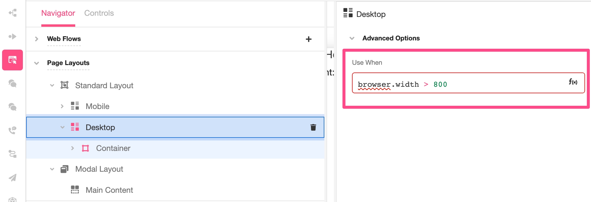
The Desktop Layout is intended to be used when Web Pages are opened in browsers. By default, this is defined by windows greater than 800 pixels wide. To change this, Inspect the Desktop element and change the value given under Advanced Options > Use When.

This field expects a Boolean. The Desktop Layout will be applied to Page Layouts when it is equal to TRUE, provided the Mobile Layout does not take overwrite it.
📘 The Mobile Layout takes precedence over the Desktop layout. If the Use When value is
TRUEfor both the Mobile and Desktop layout, the Mobile layout will be the one used. To avoid confusion, define the Use When values the Mobile and Desktop layouts as mutually exclusive.
The default value of Use When is given as follows:
browser.width > 800browser.width refers to a standard value automatically collected by the Airkit platform. See Standard Journey Data for more information.
Modal Layout
The Modal Layout applies when Web Pages are opened as modals from a Desktop Layout.
When a Web Flow is opened as a modal, the user must finish the modal flow before returning to the screen that opened it. Modals are intended to be used to create things like short confirmation screens or a lists of instructions that users might want to return to periodically. The assumption is that a modal encompasses a quick tangent from the overarching Journey flow, and this assumption is baked into the structure of the Modal Layout.
Modal Layouts are less customizable than Standard Layouts. No containers can be added to the Modal Layout; it can consist only of the Container for the Main Content. Likewise, styling options are more limited. When a modal appears over a Mobile Layout, it slides into place above the initial Web Page, filling the screen. When a modal appears over a Desktop Layout, it appears in small pop-up in the middle of the screen. It is only this pop-up that can be styled in the Inspector when accessing Page Layouts > Modal Layout.
Last updated
Was this helpful?

